Have you noticed that there is a tendency for “vintage” graphic designs for beer, wine and spirits? While doing my shopping, I spotted these products with graphic designs inspired by the “good old days”.
I’ve seen real artistic efforts in illustration, often times with complex decorations. It reflects a desire to assert the traditional aspect of the product, creating a sense of nostalgia or emphasizing a page in history, with typographical “tricks” and hand drawings resembling packaging from 100 years ago or more.
Some exemples
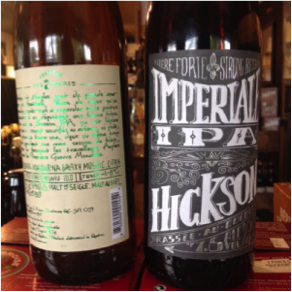
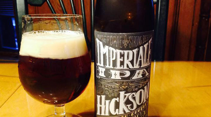
In my last blog, I showed you some beers from Hickson and Charles-Henri by Brasserie Les 2 Frères. You’ll notice that the design from Hickson is heavily craft oriented. It includes a page of Montreal’s history and an interesting graphic signature. The use of a metallic finish for the text on the bottle’s back adds a poetic touch.
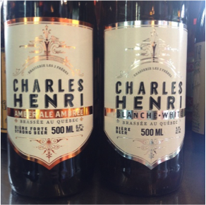
The Charles-Henri beer proposes another antique rendition, but a little more bourgeois. Its period font, metallic touches and detailed graphics look venerable, but with a modern flare. The label, with its metallic finish and clarity of design, communicates the desire to produce a beautiful product, brewed with care.
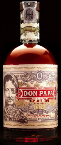
In the spirits category, here is an inspiring example of vintage that combines a selection of paper, an advanced design and elaborate bottle decor.
Don Papa Rum offers not only a breathtaking label illustrated with great care, but it also incorporates colors and design finesse with the highest resolution. Note that the cap is decorated with a “ring” and topped with an equally detailed seal.
Such attention to detail communicates attention to developing a product that is enjoyed quietly and respectfully. Choosing a vintage design is certainly aimed at carving out credibility in the industry while, surprise!, the company was only founded in 2011 and offers products aged in oak barrels.
What vintage demands
You’ve now noticed that the vintage look requires high print quality. Also, the inlay of metal finishes adds complexity. Add to this the possibilities of embossing, varnishing, silk-screening and “hot stamping”. Each process is a technique with multiple applications.
So, making beautiful labels, you guessed it, is a team effort. Make sure you have a designer that can work with you to facilitate such product packaging.
Conclusion
Inspired? Want to produce a remarkable and memorable label? Buddy up with specialists for the production of your next beer, wine or spirits labels. We will be great counsellors.