In 2012, Michelle Obama served up a lesson to the packaging industry. The lesson was how to effectively reach out to a target audience through food packaging and make them understand what to eat to be healthy.
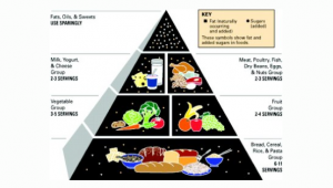
This was the launch of the MyPlate program, by the US department of Agriculture, and Michelle Obama was its spokesperson. Its aim was to reduce child obesity rates. The previous US government dietary guideline called “Food Pyramid” had an explanatory icon that showed the proportion of the different food types you needed to eat to be healthy.
But this “Food pyramid” and the other information that the USDA was putting out was not helping curb obesity. In fact, obesity rates were continuing to climb drastically. Between 1980 and 2012, they had more than doubled.
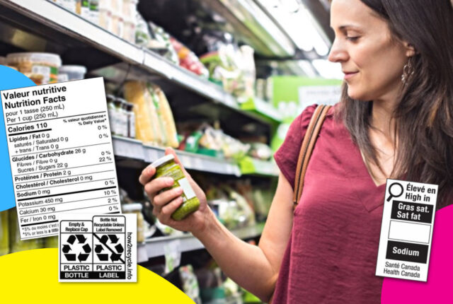
There have long been mandatory nutritional facts on foods (the format we now see on labels were started in 1995 in the USA and in 2005 in Canada), but there needed to be a simple way to explain what kind of foods to consume and in what proportions. A simple way that everyone could understand.
Simple labelling
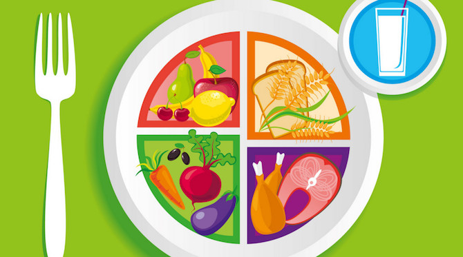
The icon that myplate program came up with is stunning its simplicity and delivery. It shows a plate with the different food groups sitting in it.
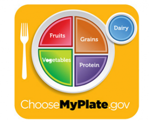
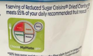
When this icon appears on a packaging, it changes slightly to identify what food group the product belongs to.
The program was well received by Food industry professionals. Rob MacKie from the American Bakers Association put it this way: “It’s brilliant in its simplicity. It’s something the average American can look at and get a visual feel for how they can fill up a plate at a meal.”
The lesson this particular labelling teaches us could be divided in three categories:
Adapt to your audience
The label is ideal for its primary audience, children. Setting it in a plate gives practicality. If you are not sure about your plate, you just look at the logo.
Make a paradigm shift
The Food Pyramid was a sophisticated graphic illustration showing the different foods you could choose from, the number of servings in a day, and references to sugars, fats and oils. Kind of hard to imagine proper quantities using a pyramid. The MyPlate logo is centered on the immediate, the here and now. Its labelling brings the information more directly to the point of view of the consumer.
Simplify
The information is quite simplified. It doesn’t have to be otherwise since children and adults alike are getting the more detailed information such what are proteins and what are grains etc. from other sources.
The next time you set out to package a product or create labelling, have a look at the MyPlate logo and see if you can do as well! And remember, were always there to help.