Almost all the products we encounter are equipped with barcodes that we’ve seen so many times we barely notice them anymore. In fact, most of the time we only notice barcodes when the scanner fails to read them correctly at the cash register. This is why it’s so important for barcodes to be printed according to minimum quality standards.
Barcodes play a major role in the distribution and purchasing of products, hence the need for everyone involved in the production of barcodes to ensure their quality. Package designers need to emphasize this, namely at the design and packaging stages. Printers also need to be thorough when it comes to choosing the right printing technology.
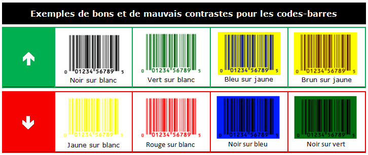
Scannability = good contrast
A barcode is composed not only of vertical lines but also of spaces in between these lines. It’s the contrast between these two elements that allows the scanning device to distinguish them and thus to read the code.
- Colour is the main factor that influences contrast. Naturally, black on white in spot colours provides the best contrast. Semitones and the colour red (or similar shades) should not be used for the bars because if scanners using digital imagery can read them easily, this is not the case for laser scanners which cannot read red at all.
Although there are scanners that are able to scan barcodes with weak contrasts, it’s better to use very dark colours for the bars and very light colours for the spaces.
- The design of the package should also take into account the material and how it can influence the contrast. Materials where the product can be seen through the container and thus through the barcode can prevent the scan of the barcode, even if it’s printed in black. The simplest solution (which is used the most) is to apply the barcode to a white rectangle.
As only a few millimeters are necessary for the quiet zone (which will be discussed in more detail in the second blog post of the series), the opaque rectangle will not affect your product’s visibility.

- Reflective materials also cause scannability problems. For the best possible contrast, it’s recommended to print the barcode in black on top of a white tint area. If this is not possible, then reversed printing for the barcode is a viable option, or in other words printing the spaces in a light colour and having the reflective material serve as the bars.
- An overlay on top of the code, even if it’s transparent, will also prevent the scan of the barcode. During promotions where products are grouped together by means of a removable film, for example, the barcodes should not be covered.
In my second blog post on this topic, I will discuss the size and position of the barcode according to the type of package in order to ensure good scannability. Don’t miss it!